Logo re-design or a fresh new start?
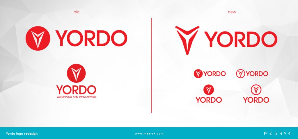
Yordo delivers uniforms for national teams and about 200 local clubs worldwide from Switzerland to USA, Canada and Israel. Yordo has been in business for nearly 10 years. Their logo can be seen on all garments they make. They do not appear in tv ads but still, they serve over 20 countries from around the world. The idea of refreshing the brand has come up recently.
First step first, we started with the logo. We created a few new designs in line with the current trends. Most of them wasn’t convincing, but there was one what everybody liked. Despite this one received a very good welcome from the company, decision wasn’t made quickly. Many things had to be considered by the company. Introducing a completely new logo requires a great deal of after-work. The new logo must appear on all surfaces almost immediately, and most importantly, consequently. That is a big change and it’s not always paying off, so we took another path to see what can be done with the old logo?
The old logo is a word logo with sharp angels, strict, square letters seemed a bit cold to us, so we focused our attention to that. It became clear that this is the right direction for Yordo when we came up with the first sketches. The good old logo facelifted, in the way the company can stand for with all their heart.

There are plenty of examples from around the world – good as well as bad examples. We often see huge companies (Google, Facebook, Citroen end so on) with a facelifted logo. In our examples, Google and Facebook made very tiny changes that an average user might not even notice, while Citroen’s logo has drastically changed. The sharp angles have disappeared from the double chevron. The change was deeply dividing but Citroen consequently pushed their well-built re-branding through. They probably had a good reason for the change.
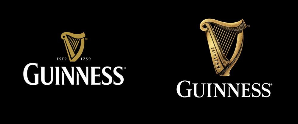
One of our favourites is the new Guinness logo. They make beer since 1759. The harp, as a symbol was registered as a Guinness company trademark in 1876. The look of the harp gradually went to a minimalist design, and by 2005, only a few hard lines left, in line with the actual trends. In 2016, the company again went for a change, but in another direction. The logo was faced with the challenge of revamping its identity without drifting from the harp heritage, but rather, adding more life to the harp symbol. And so, it came up with a new 3D look to tell the brand’s history. The New Guinness Logo is utterly beautiful and has more feel to it. The details in the logo show professional craftsmanship. A perfect change.

If you are a business owner, take this moment to think for a second. Have a look at your business card. What can you see? Is your logo meet today’s expectations? Would it give a good first impression? It’s crucial as you won’t have a second chance to communicate your brand essence in a way like a logo does so it must convey the right impression immediately. If it’s not, or you just have a feeling that it could be better, then think further. Is there a chance to do a little face-lift of the old logo? Or a complete change needed to get that desired first impression? You might want to consider how well-known is your old logo? Are your customers loyal to your current brand, including the old logo? Or that wasn’t too typical? Do you think re-positioning your brand might attract new customers? Then think of how many platforms you will need to introduce the new logo. Can you consistently push the new brand through on all areas?
So many questions – you might not know the answers yet. Feel free to contact us, let us know your brand and we will be happy to give you professional advice.
